AB Test - Registration

Objective:
Increase registration on the site.
Solution:
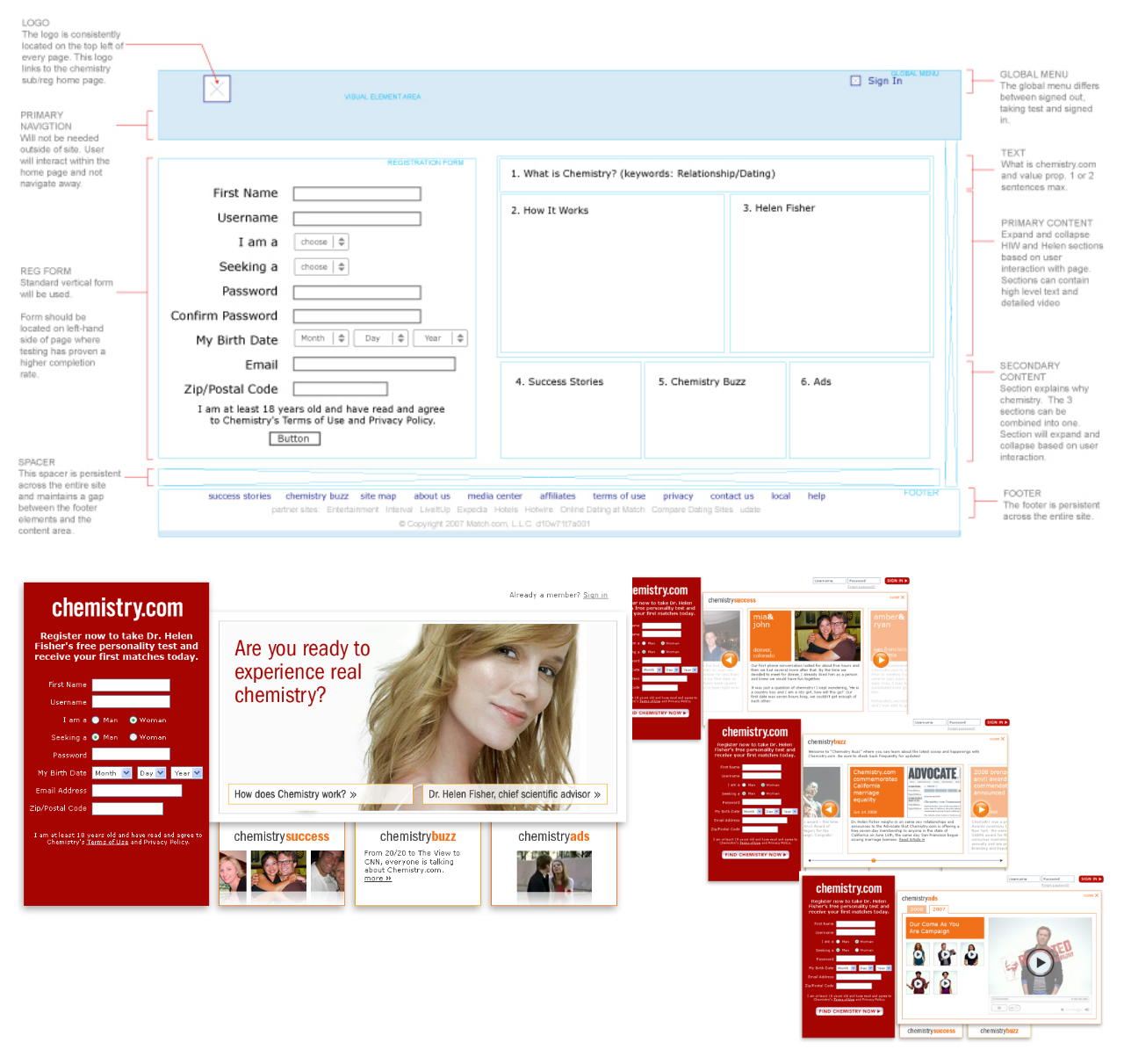
Designed an experience where the registration form would always remain visible on the left side of the screen while users learned more about the site on the right.
Process:
- Analyzed the home page, landing pages, signed-out content and registration process on competitor and non-competitor sites to develop general guidelines and determine best practices.
- Determined that we were aligned with other sites. Variations were related to the information collected, button CTA, colors and images (all of which we tested regularly).
- Proposed testing the standard approach and developed an experience where the registration form would be shown on every page when not signed in.
- Created wireframes to illustrate the concept for all external/signed-out pages.
- Presented the concept and wireframes to the management team for approval.
- Upon approval, collaborated with the creative team to design the pages.
- Wrote user stories to define requirements for implementation by development of the new concept as an AB test against the current home page.
Results:
The new approach did not result in more registrations. We tried changing the images and secondary colors but could never beat the existing home page/experience, and the test was discontinued.